Padel is becoming one the world’s fastest growing sporting communities. A blend of tennis and squash, padel is played in teams of doubles for twice the fun. Its accessibility, inclusivity, and affordability make it a well-loved sport for people of all ages and fitness levels worldwide. Think of it as tennis’ cooler, more social younger brother – it’s more about enjoyment and camaraderie than intense competition.
So, how do we strike the perfect balance between becoming a leading name in the padel industry, whilst also fostering new connections, fitness and passion at our vibrant Soul Padel centres?
By igniting the spirit of community and competition.

FINDING THE HEART
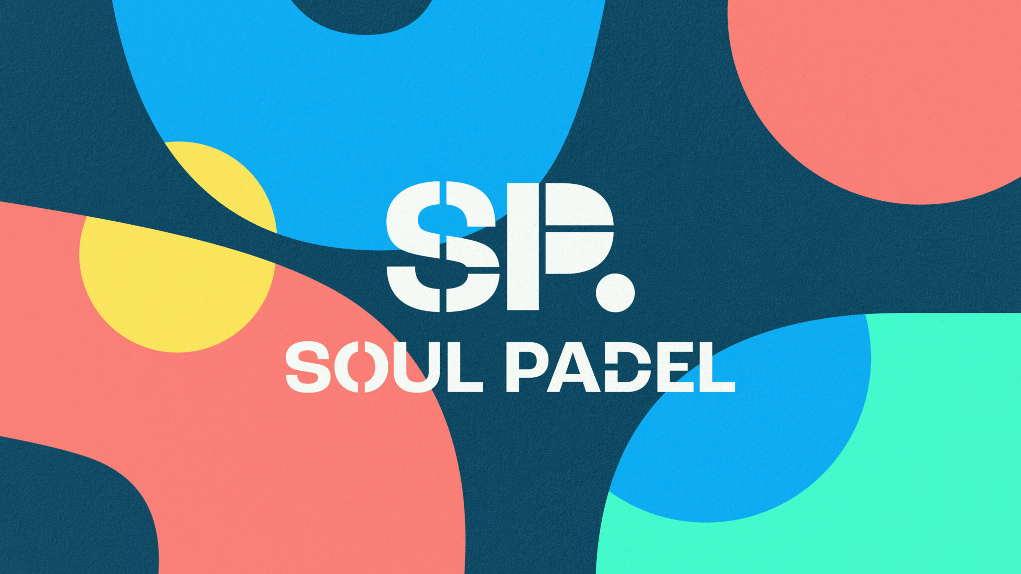
As part of our Give Life To Purpose process, we crafted a unique brand identity for Soul Padel.
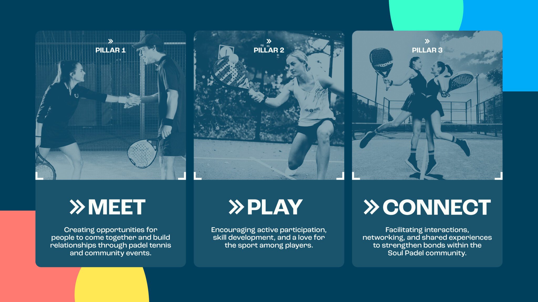
It was clear that the core values, Meet, Play, Connect, were at the heart of their offering. It’s all about ensuring everyone can join the Soul Padel community and enjoy their time on court, regardless of ability.
Their target audiences: fitness enthusiasts and families, were key to our development, so we built an identity platform for Soul Padel that could bring them together.
BRINGING THE LIFE
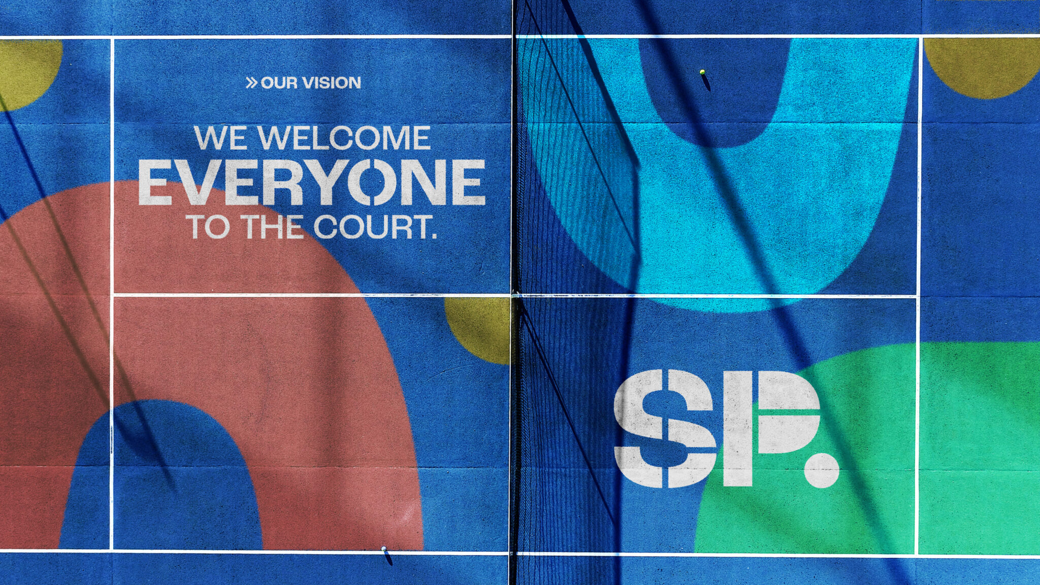
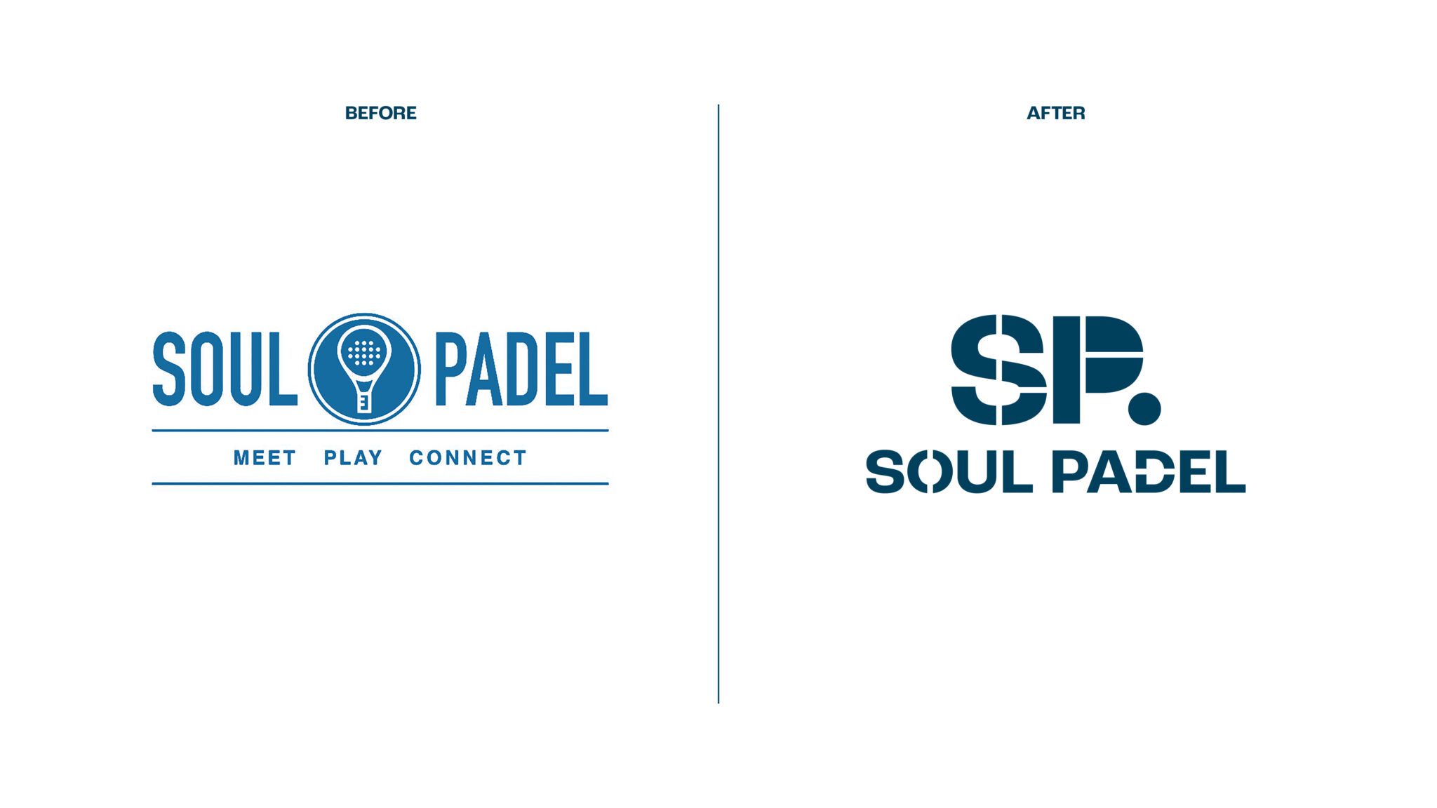
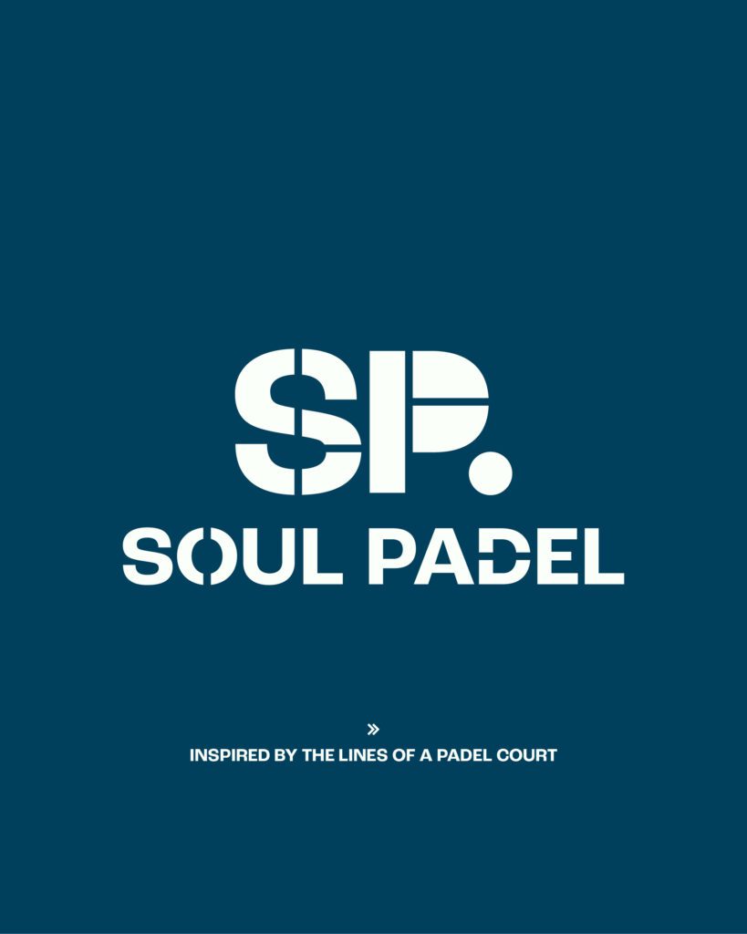
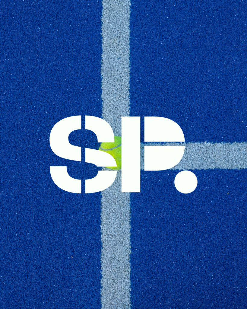
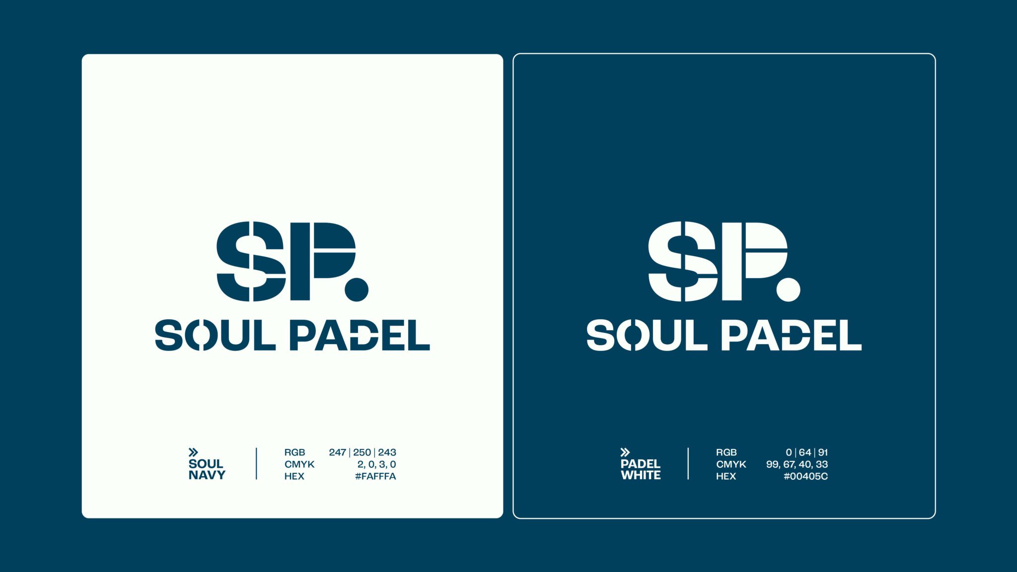
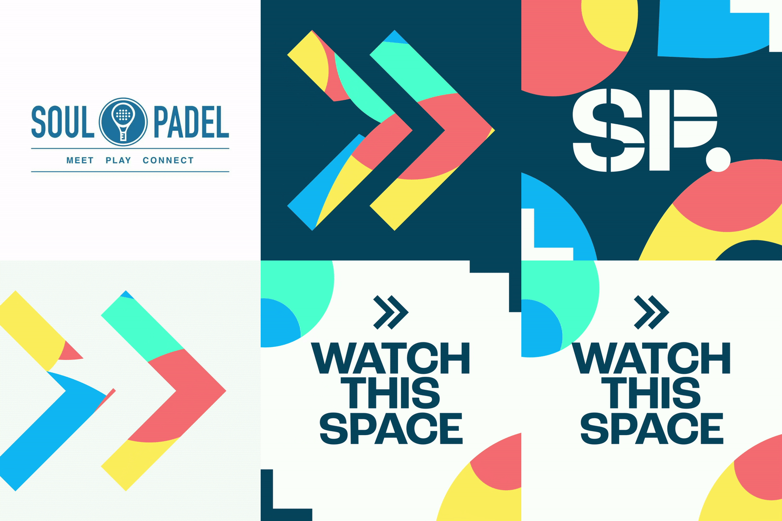
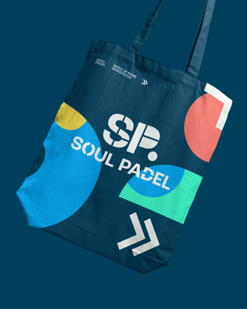
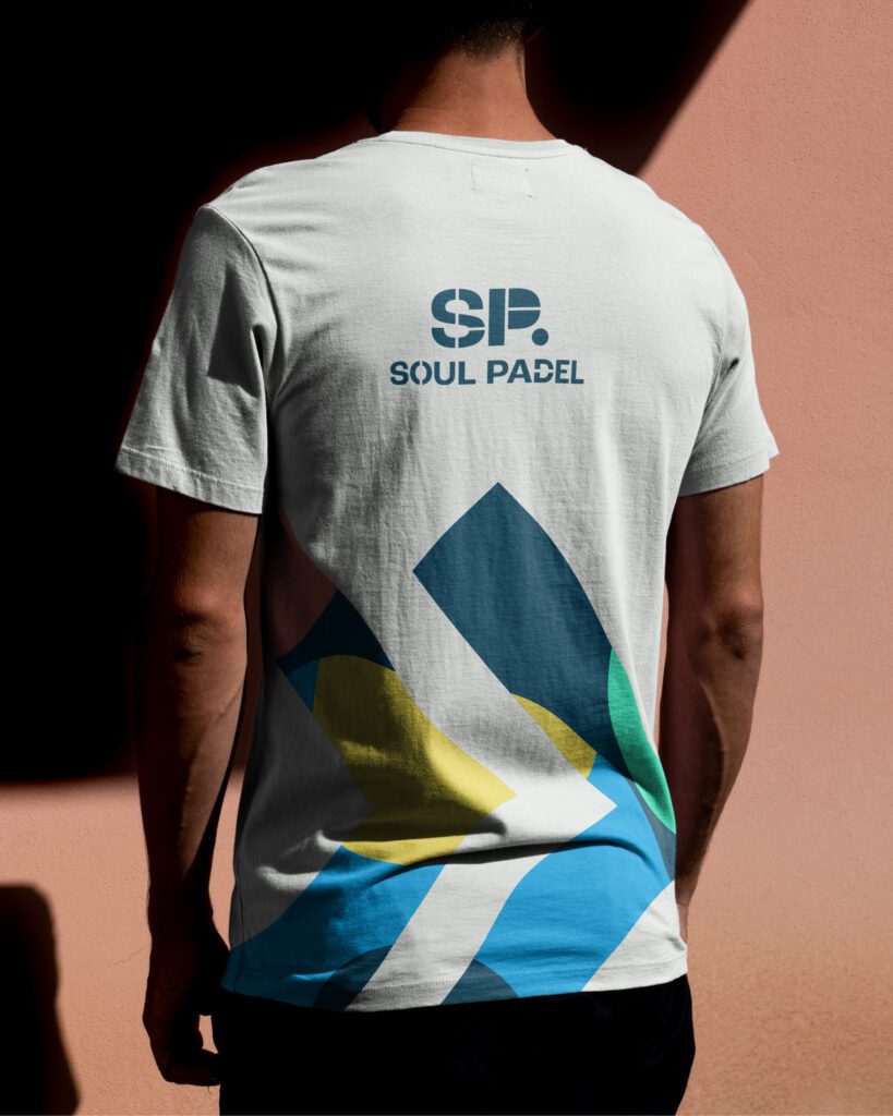
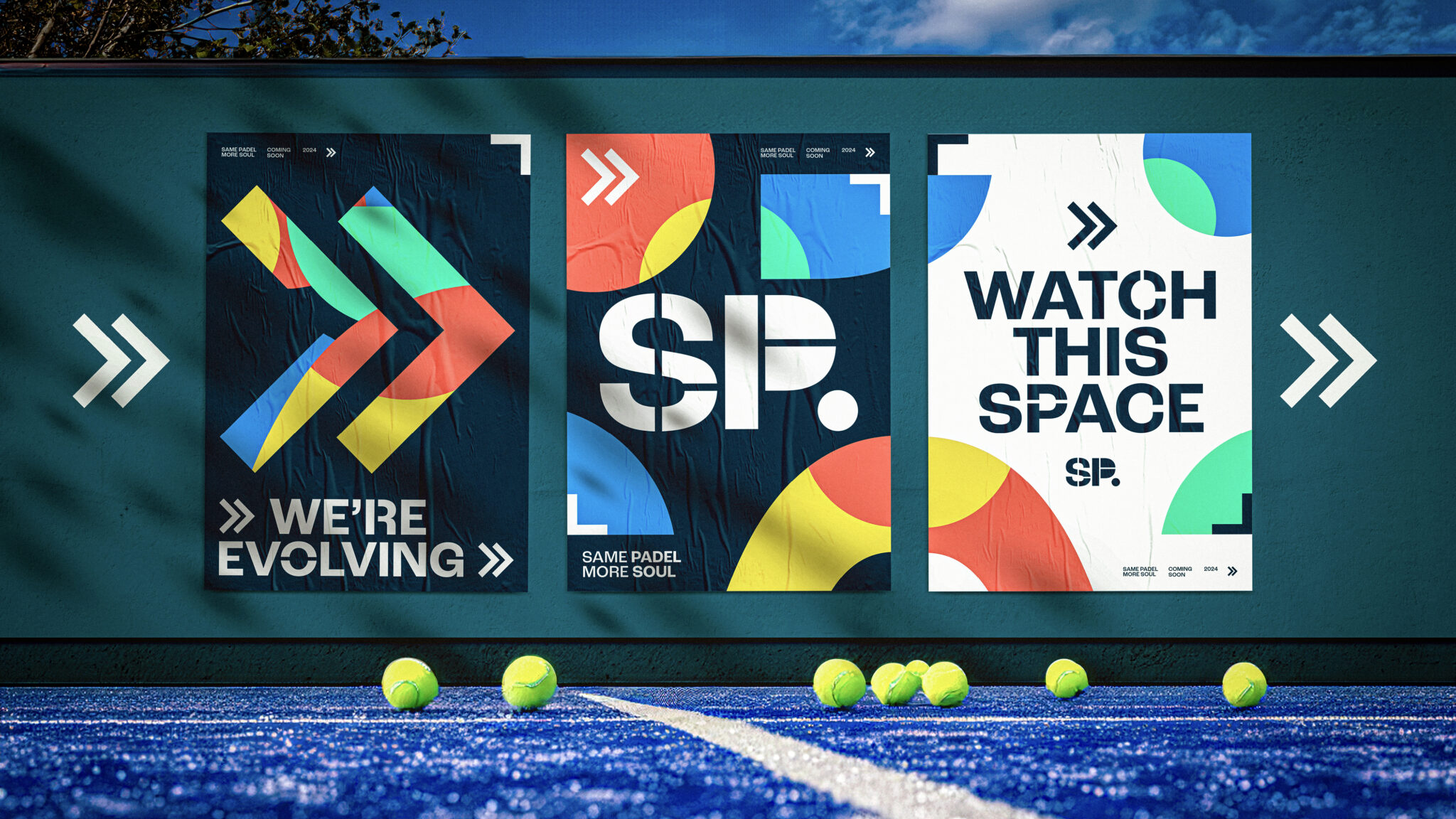
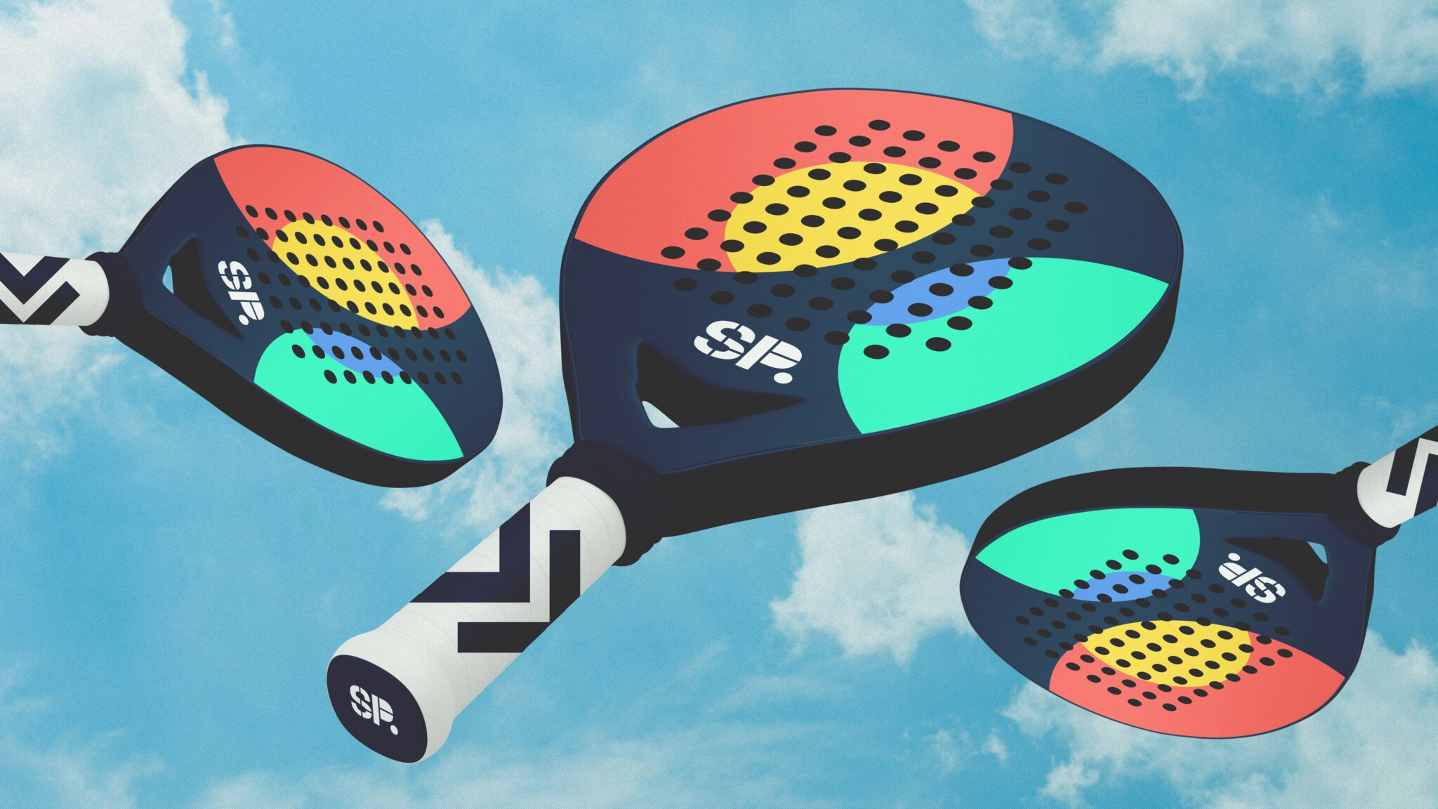
Soul Padel needed a brand identity that reflected its positioning as a cool, playful and inclusive brand. We took this opportunity to redesign the logo, changing it to represent a top-down view of a Padel court. Then court lines divide the icon, creating separate shapes to symbolise the different communities coming together to play, and a circle references the ball. To create a truly ownable logo, we even incorporated the court lines into the typography below the icon.
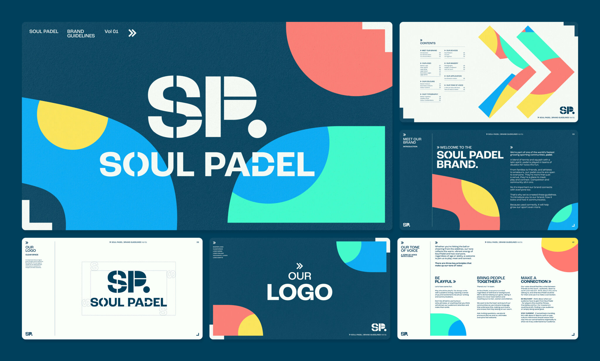
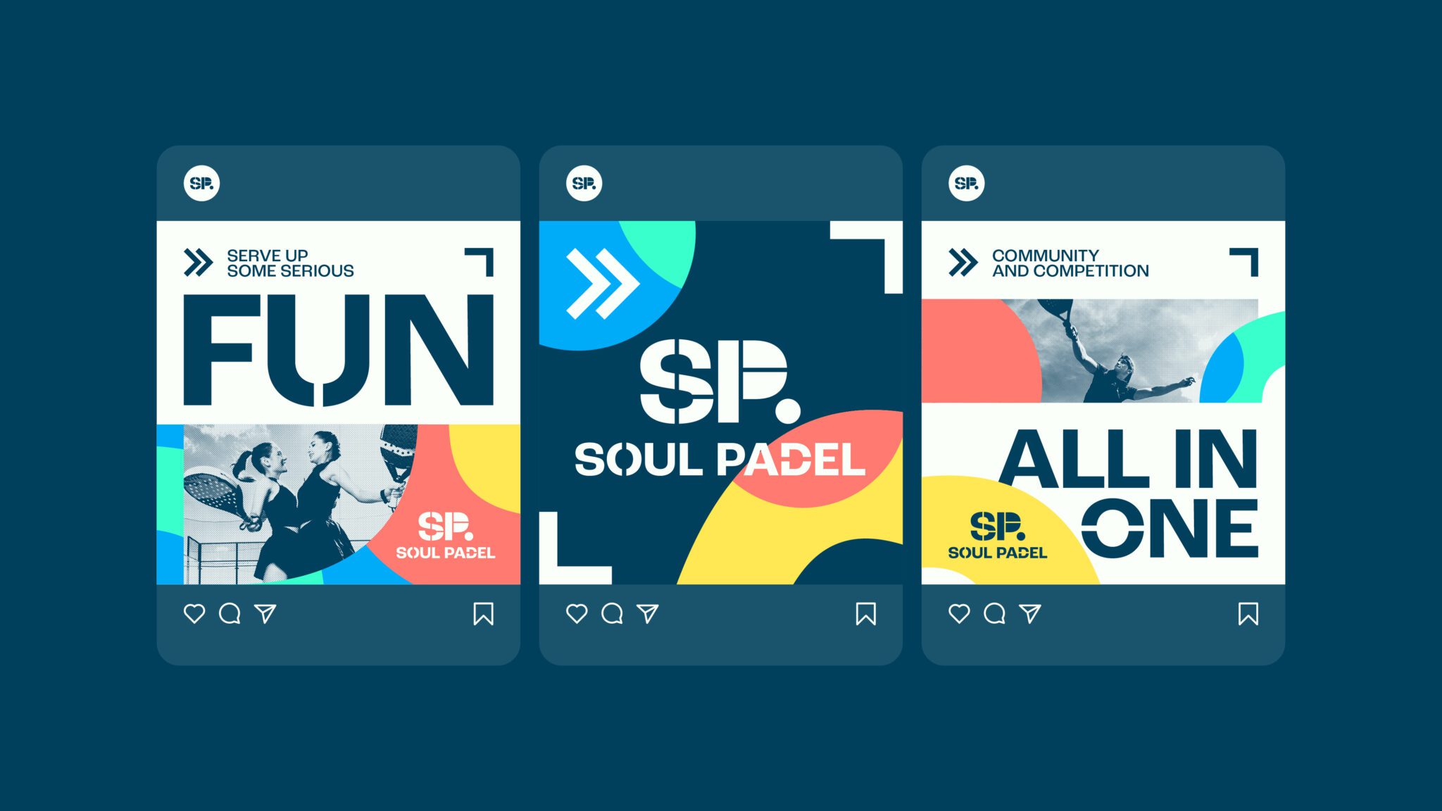
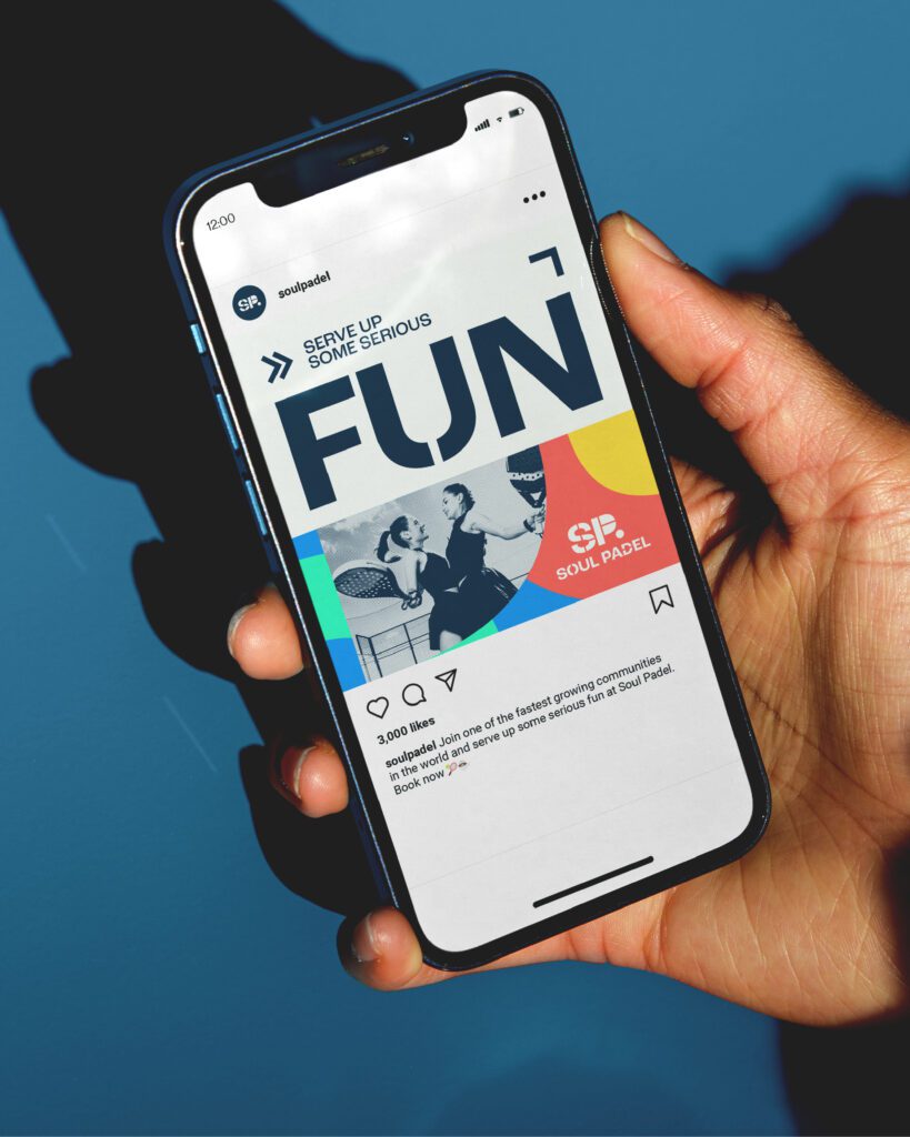
It’s not just our look we had some serious fun with. We made sure Soul Padel has a tone of voice that makes every piece of communication thrive. To complement our visuals, our language is playful, inviting, and down to earth, reflecting the depth at which Soul Padel wants to bring joy to communities and foster genuine connections.
MAKING IT THRIVE
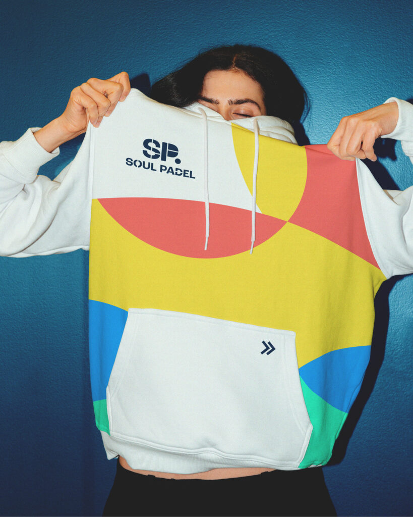
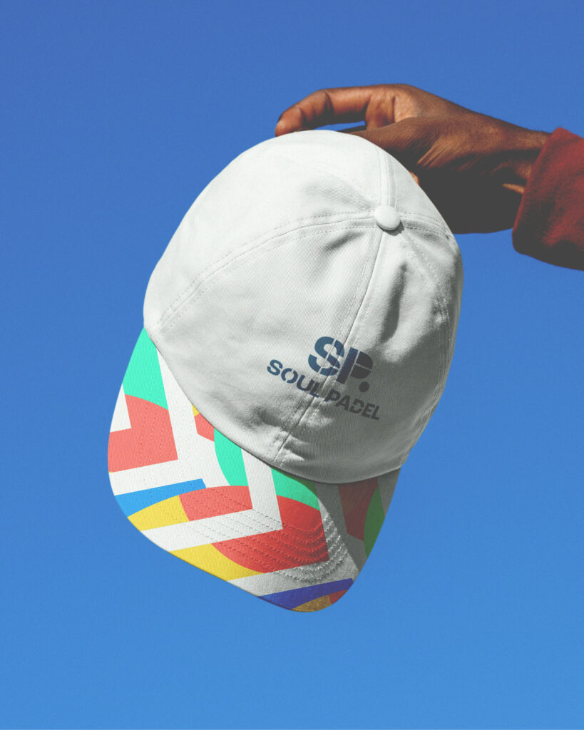
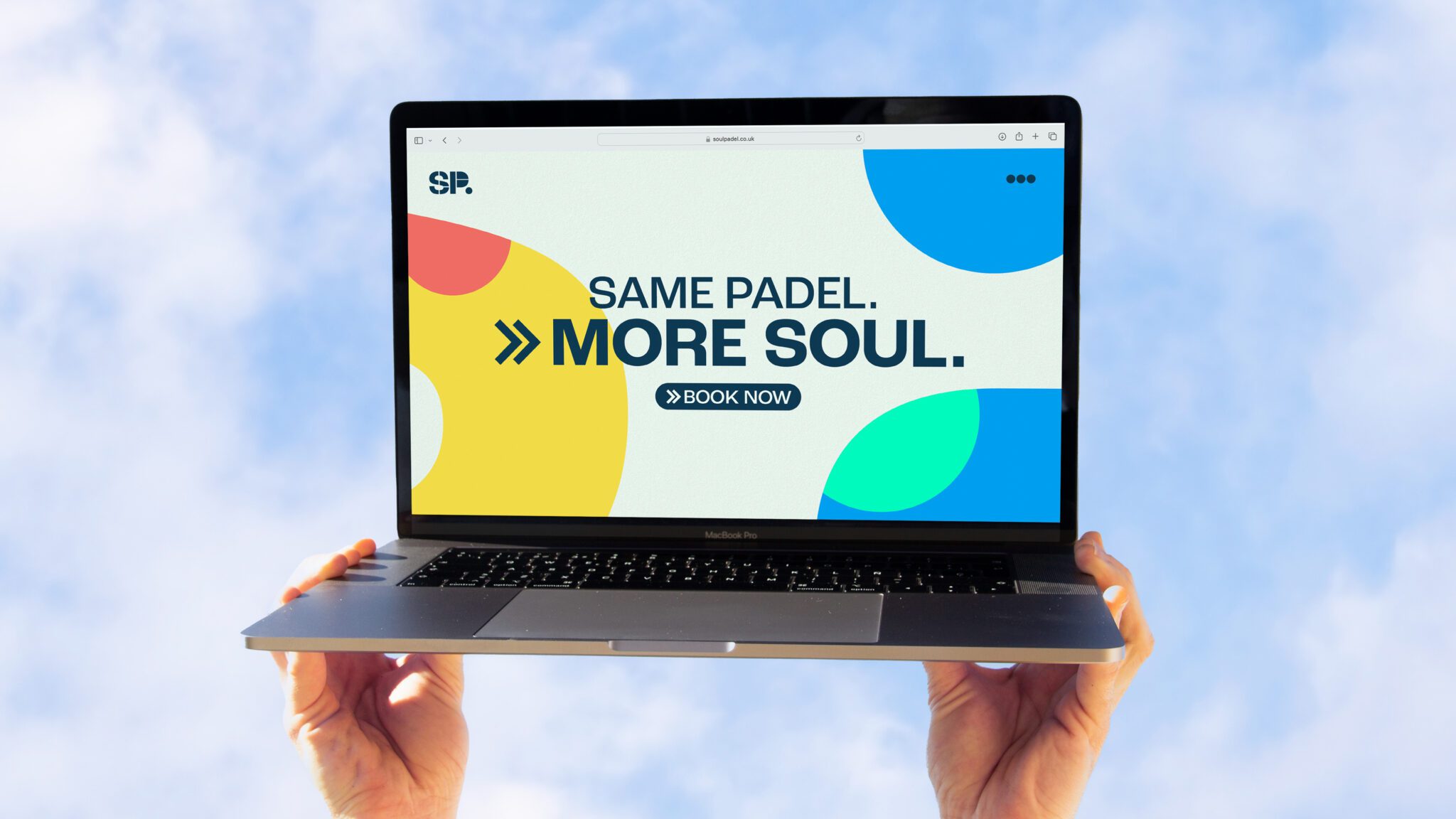
We created a series of colourful patterns built out of shapes in the logo. These patterns infuse a playful energy into the Soul Padel brand and can be seamlessly integrated into communications and the design of Soul Padel centres.
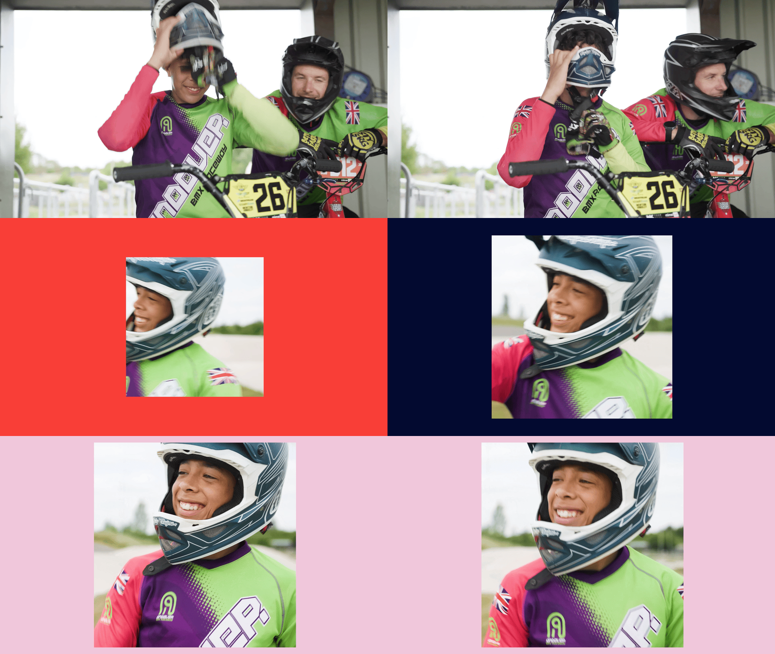
Additionally, we adopted a unique photographic style. Action and lifestyle shots are enhanced with a colour wash using the master brand palette to reinforce the brand’s dynamic identity.
THE IMPACT
The new brand is starting to roll out in Soul Padel centres, helping to invite new community members onto the court and grow the game.
“We are so proud of our new brand. It is everything we wanted Soul Padel to be and it speaks our vision and values in a fun, social and very approachable way. It’s colourful, playful and very adaptable to physical and online environments and it has great potential as we develop our business and evolve. Cravens worked closely with the founders and have exceeded our expectations – we are delighted with the final product.” – Mark Hewlett, Founder & CEO
