
Recast is a global streaming platform making access to quality content fairer – both for the viewers watching and the people creating it. Where fans pay per view, rather than a subscription. And up to 85% of the income goes directly to the content creators themselves.
But as start-up going against convention in pursuit of fairness, how do you create a brand with enough impact to reach the audiences that will value you?
By making every connection meaningful.


Finding the heart
As a tech start-up with big plans, it was important everyone had the same vision for Recast. So as part of our Give Life To Purpose process, we talked to people right across the business, from the Chief Exec to the dev teams, and marketing to sales. It was clear that fairness and accessibility were at the heart of their offering: making sure everyone could share and enjoy quality entertainment, sport, music and gaming content without barriers.
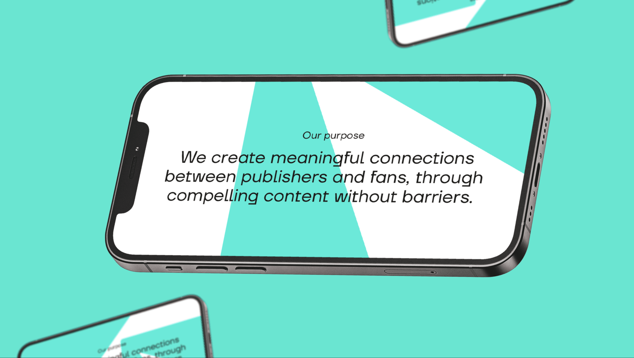
Their two audiences: publishers and fans, were key to this, so we built an Embedded Organising Purpose that showed how Recast’s platform could bring them together.
Bringing the life
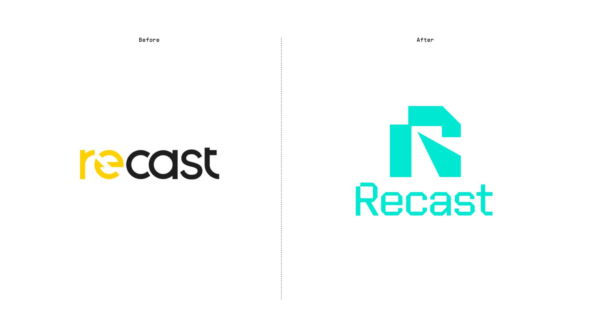
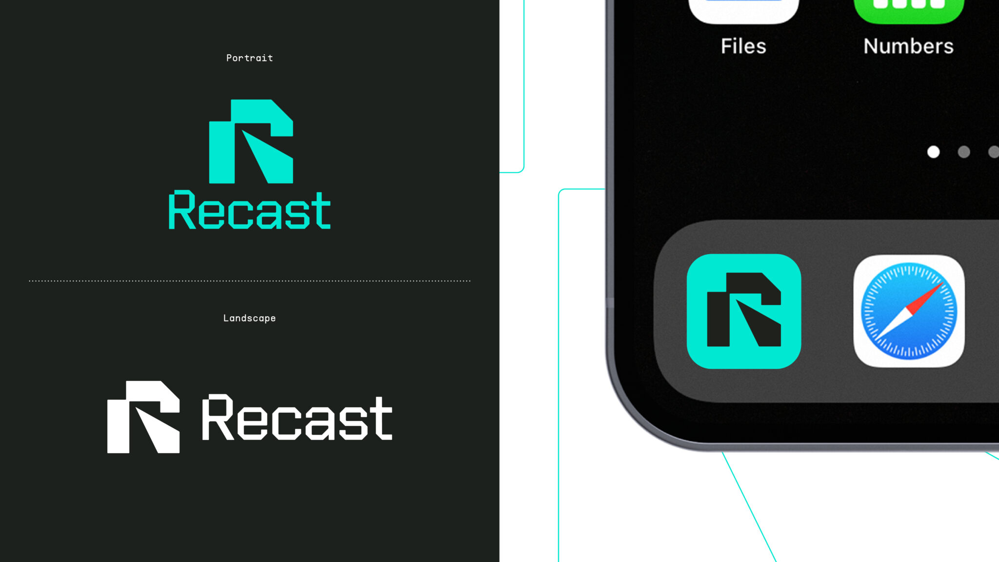
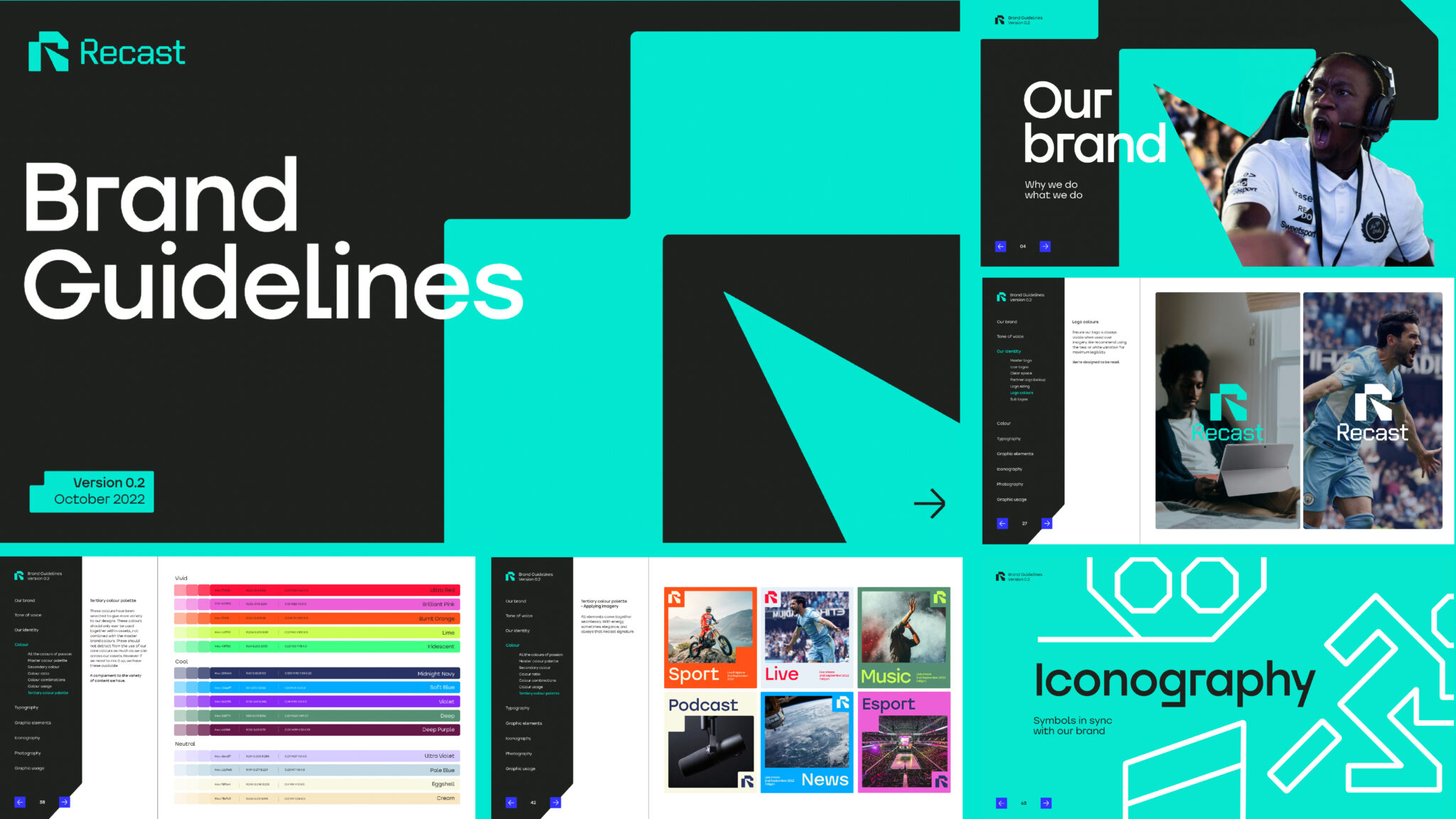
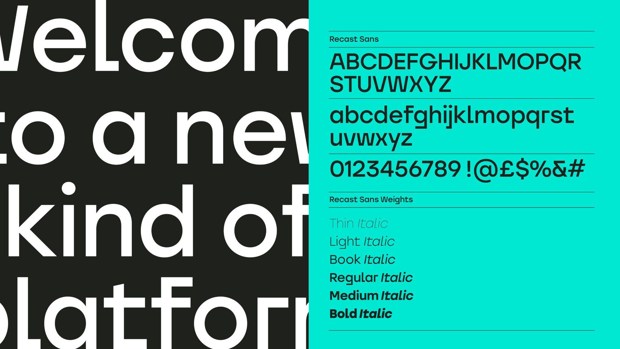
Recast needed an aligned identity that reflected its commitment to fairness and compelling content. We used the R in the name to create a beam graphic that put streaming in the spotlight. The distinctive R made for a powerful app icon, as well as a flexible device to form the rest of the system from. Paired with a diverse palette and a bespoke typeface it makes Recast’s content and comms unmistakable, ensuring a deep connection with its audiences.
Of course, it’s not just your look that defines you, how you speak does too. We made sure Recast has a tone of voice that is assertive, but also explorative and passionate – demonstrating the depth of its knowledge and the breadth of content.

Making it thrive
As a streaming platform, it was vital the new brand worked seamlessly across the site and app. The design system, built from the R, allowed the site to showcase content and talk about the Recast difference in a compelling way, while the angular style elements mean content can be showcased in a uniquely Recast way.
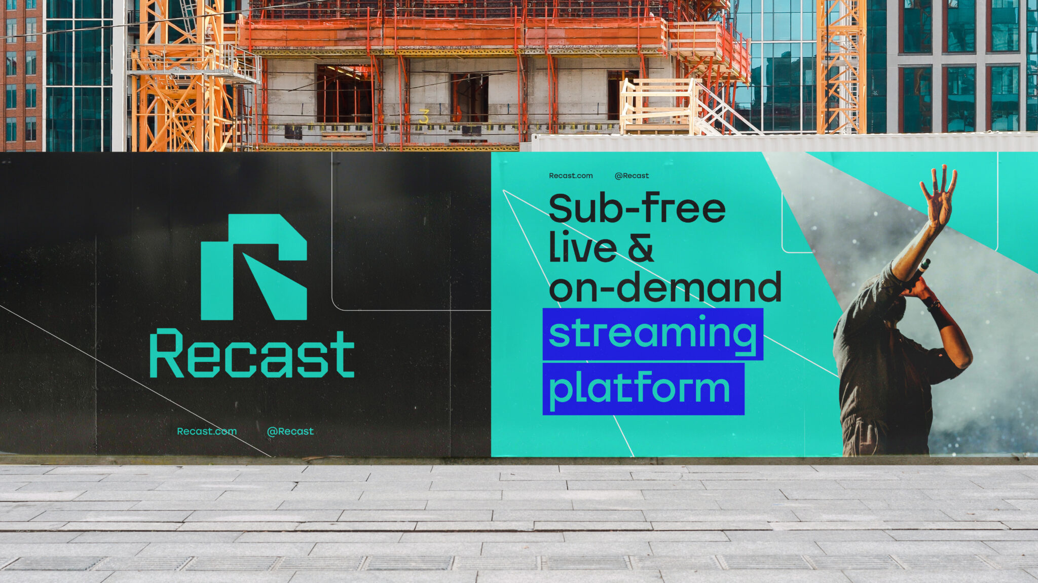
The new look and tone of voice is also helping Recast’s digital and social communications to stand out. Telling the world about the exclusive content that can be accessed fairer for all.

The impact


