Welcome to the inaugural issue of Seen & Heard – our monthly rundown of noteworthy nuggets from the world of advertising, design and creativity. Let’s take a look and see what’s been ruffling our studio’s creative feathers this past month…
Naturenauts PWA
The Natural History Museum

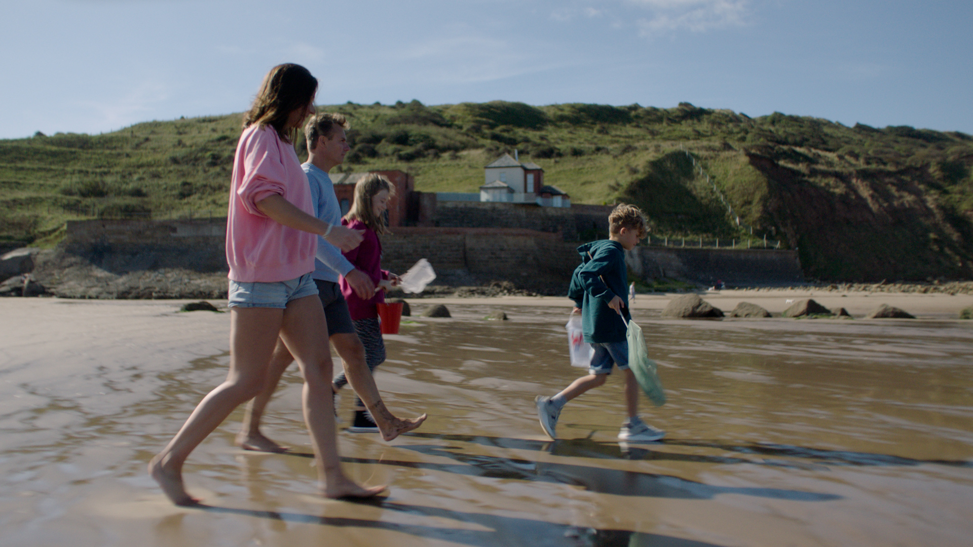
Commissioned by The Natural History Museum to promote the upcoming Dippy Tour, this cute little PWA lets kids and their grown ups explore the natural world. With the help of Dippy the Diplodocus and Fern the friendly fox, kids will complete simple tasks, learn about the colours of nature, identify common plants, flowers and trees, and earn badges as they go.
Dippy himself – the Natural History Museum’s iconic Diplodocus skeleton cast – hits the Great North Museum: Hancock on 18th May 2018.
Get the Naturenauts webapp ›
Find out more on the Great North Museum: Hancock website ›
Cereal Typeface
Airbnb Design

A collaboration between their in-house design studio and renowned type foundry Dalton Maag, Cereal is Airbnb’s new brand font. Following the movement of brands commissioning bespoke typefaces as both a design and cost-saving exercise, Cereal is a modern geometric sans with just enough character to set it apart from the classics of Frutiger, Gotham, Avenir etc. Its six weights will eventually be rolled out across all media and platforms, including its new Airbnb Plus service.
As expected, Cereal has its own microsite, detailing the original thought behind the font. Check out the interactive overview, and watch the lovely little intro film below to find out more.
Check out the Airbnb Design website ›
Animated Book Covers
Henning M Lederer & Julian Montague

Keeping with the geometric theme… We came across these fantastic animated book covers a while back, but thought they were well worth sharing again.
Motion designer Henning M Lederer has assembled an impressive collection of animated abstract mid-century style book covers in the form of a mesmerising short film. Based on the work of Julian Montague, a multi-disciplined creative from Buffalo, New York, Lederer has really brought these retro-style beauties to life.
After you’ve torn yourself away from that, you can check out the second set. “Existential Phenomology and Political Theory”, anyone?
Check out Henning M. Lederer on Vimeo ›
Follow Julian Montague on Instagram ›
Co-Op own-brand alcohol range
Robot Food

As summer is here and the sun’s been out to play a bit more, our afternoon thoughts have been turning to crisp lagers and hoppy and pale ales just a little more than usual. So with our thirstbuds already primed, this fresh rebrand of the Co-Op’s own-brand alcohol range couldn’t have been more timely.
Created by Leeds-based packaging design specialists Robot Food, these new cans, bottles and stubbies are sure to stand out on a crowded shelf. We love the simplicity of these reworked designs – especially the Idler type system used on the tinnies. Is it #deskbeer time yet?
Covered on It’s Nice That ›
Drink Responsibly
McCann Worldgroup

And speaking of booze, if you’re going to drink make sure you drink Responsibly. The brilliant brainchild of McCann Milan and Ubrew, this fantastically named product uses the message that appears on all beer ads to promote it. Sneaky, cheeky and smart. We’ll drink to that!
So that’s just a slice of what’s been tickling our creative pickle this past month. Stay tuned for issue 2, due – you’ve guessed it – next month.


