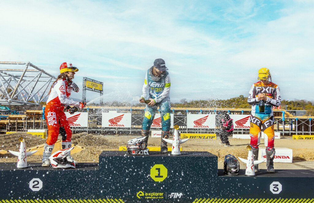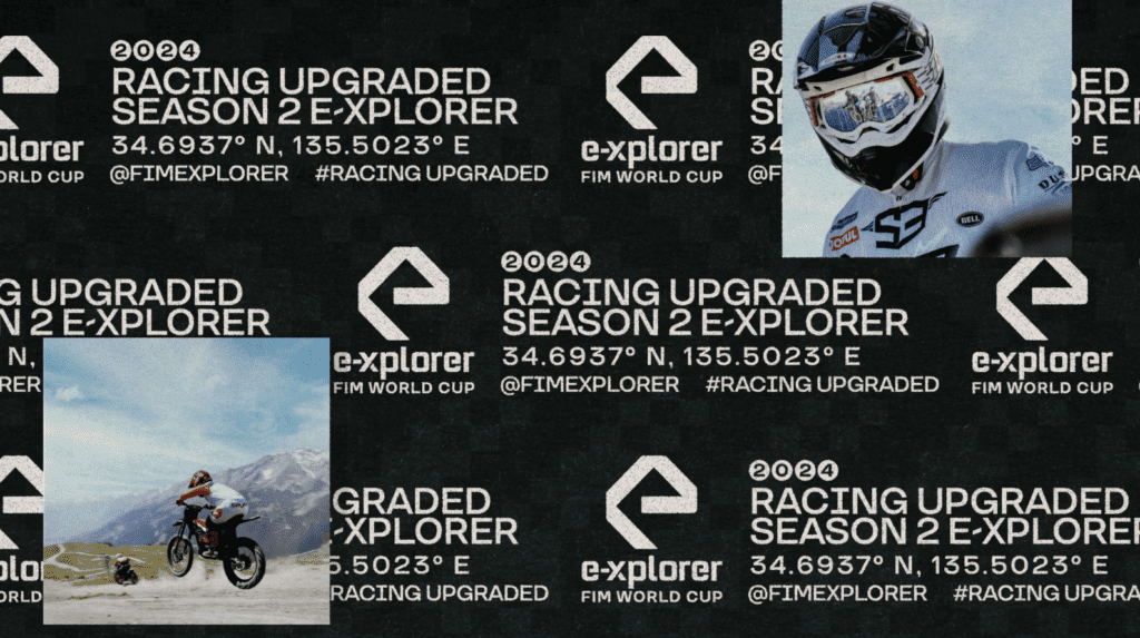
Season 2 of E-Xplorer marks a thrilling next chapter in the evolution
of our all-electric racing series.
With a keen eye on innovation, we embarked on a creative journey to infuse a fresh look and feel into season 2, centered around the principles of gamification and tech whilst remaining true to the core brand we developed back in 2021.
Redefining the Vision:
From the outset, our aim was to build upon what we crafted for season 1. Our vision for Season 2 was to create an experience that not only captivated viewers with adrenaline-charged races but also empowered them to engage with the series.
Based on our learnings from season 1 we were able to refine our look, to ensure this stood out across key audience touch points, and elevated our social content to become as engaging and shareable as possible.
Let’s get into it shall we?
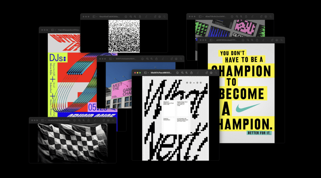
Drawing Inspiration:
With the focus being gamification and tech, we looked at a mix of places for inspiration. Ensuring whatever we developed allowed flexibility across static and motion elements from the onset.
One of these being the concept of pixelation, as this aligned with the gamification and energy we were hoping to bring to S2. We looked at pixelated typography, background pixelation and pixelated imagery effects. This inspiration would provide the perfect level of gaming energy across static and motion elements.
Another place we sought inspiration was how we could elevate our headlines, we looked at framing around the typography and how these frames could potentially be more variable when they stack. This grid like and structured approach felt very reminiscent of tech-like design.
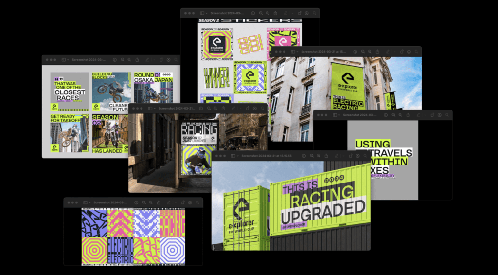
The design process:
When we looked into design routes, based on our inspiration, we explored the use of pixelation and blocky headlines as core considerations in our approaches. Incorporating this pixelated aesthetic into the backgrounds added depth and texture. Weaving blocks behind the typography, elevating our headlines, and also served as a solve as we encountered challenges with our vibrant lime green hue conflicting with certain background compositions.
We also explored the opportunity to incorporate an additional colour to the brand palette. Something that complimented our luminescent green. Ultraviolet gave our visual look a more gamified edge, as well as adding a contrasting energy to the design.

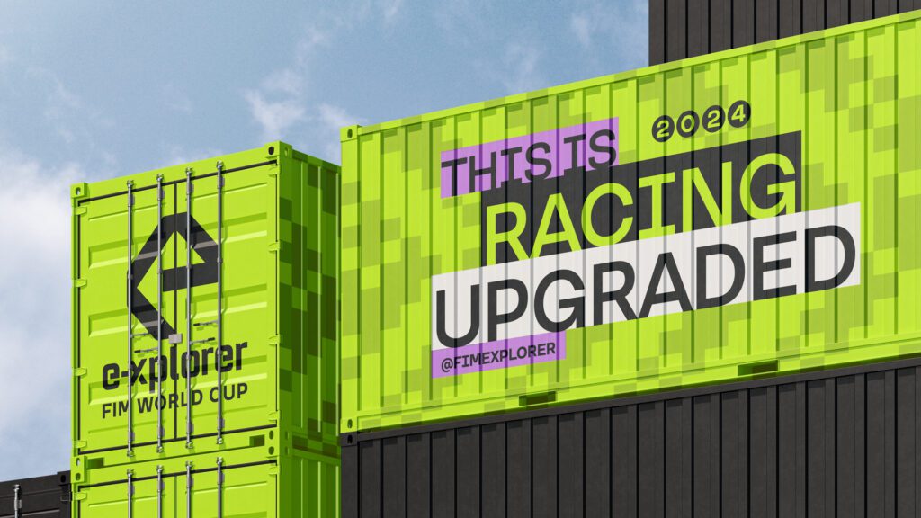
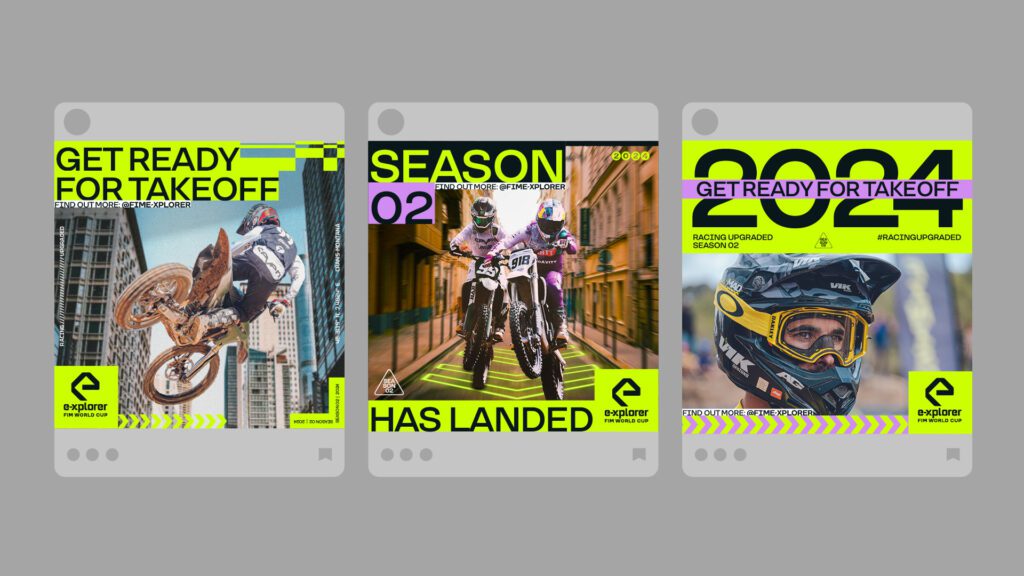
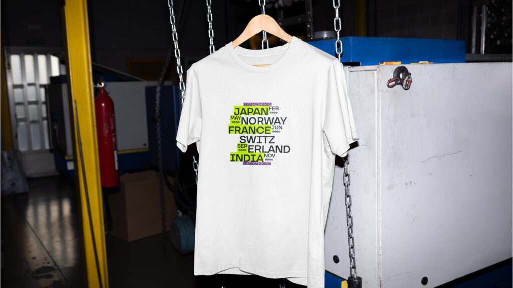
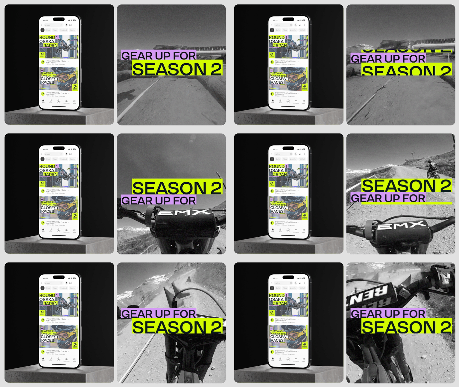
The motion exploration was developed in parallel, showing how flexible and adaptable these elements were. With a key output of each race being the highlight videos, it was important motion was explored as a key consideration within the visual development.
Launch and Beyond:

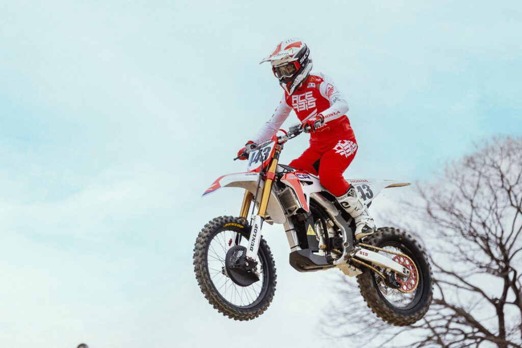
Season 2 of E-Xplorer launched with its reenergized identity in Osaka, Japan 17.02.24.
As the series continues to evolve, we remain committed to pushing the boundaries of electric racing entertainment, embracing new technologies, and engaging our audience in new and innovative ways.
Make sure to check out some of the previous races:
https://www.youtube.com/@fimexplorer
