
Case study
British Triathlon
- Brand Strategy
- Brand Identity
- Sport
- Communities
With participation habits changing, costs rising and triathlon perceived as an exclusive sport, British Triathlon needed to rethink its role. So we asked the nation what triathlon truly means to them.
Finding the heart
Through extensive stakeholder engagement, we discovered that people come to triathlon for the challenge, but they stay for the connection and the community. This helped define a new purpose and identity focused on ‘opening up triathlon so athletes and communities go further than they ever thought possible’.
Helping everyone involved in the sport: Go Further


Giving it bite
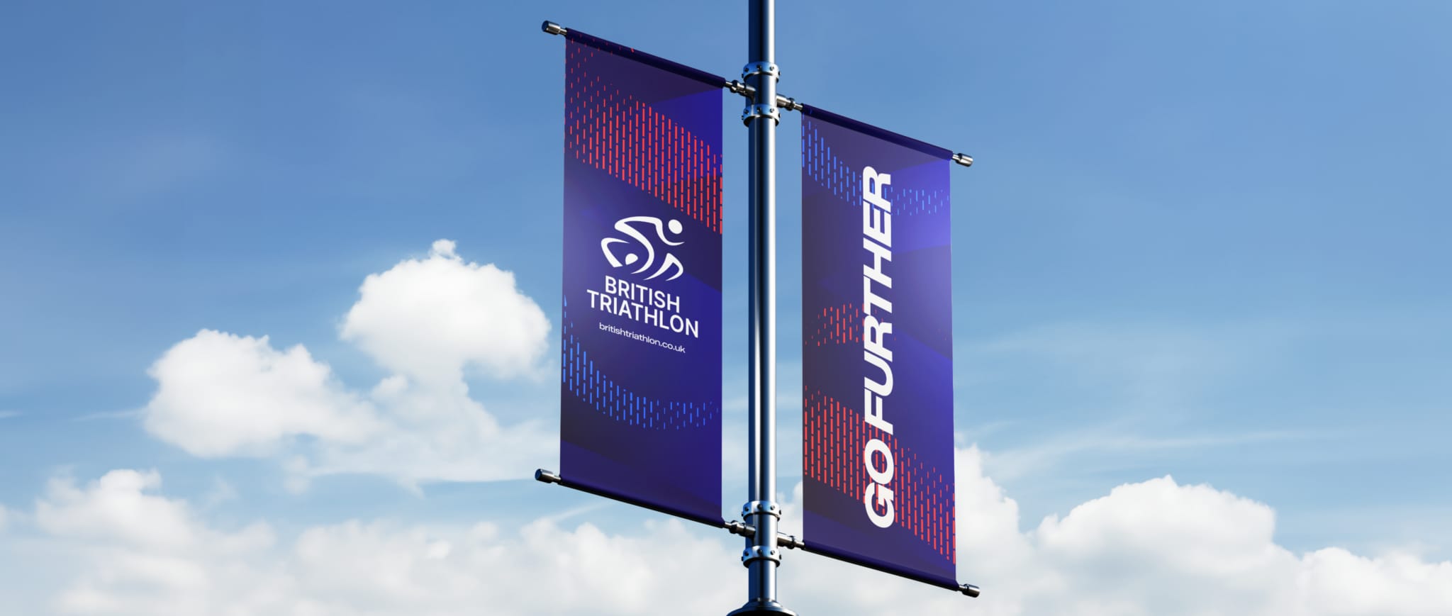
A sharp new brand identity and active tone of voice helped bring to life the spirit of our line ‘Go further’, flexing to represent everyone from elite, including mixed and para-triathlon, to events and grassroots participation. A textured pattern inspired by the British Triathlon logo, paired with dynamic, inclusive photography, helped show the progressive, intense and fulfilling nature of Triathlon.


Powering alignment
The brand identity aligned all levels of the sport, from elite and competition to community and grassroots Swim Bike Run - truly representing everyone associated with the sport. Every level and every ability was connected through their own colours and a tone of voice that combined excitement and ambition with empowerment to speak to every audience in a personal and encouraging way.


