Case study
Takk
- Brand Identity
- Brand Strategy
- Consumer Brands
Takk is rewriting the script in beauty and toiletries. Where the market bamboozles with choice, aisle upon aisle of cures for frizzy, greasy, fine, "problem" hair, when hair is basically hair, Takk deals in essentials only: sustainable, responsible, and free from the paradox of choice.
But as a challenger brand in a market built on the next innovation and the next niche answer, how do you stand out? By making the essentials beautifully simple.
Finding the heart
We've worked with Takk almost since the brand's inception. With such a distinctive mission, we needed a purpose that handed control back to the consumer, freeing them from the array of choice the beauty aisle throws at them. A subscription model simplifies things further still: everything taken care of, so customers can focus on what matters more.


Giving it bite
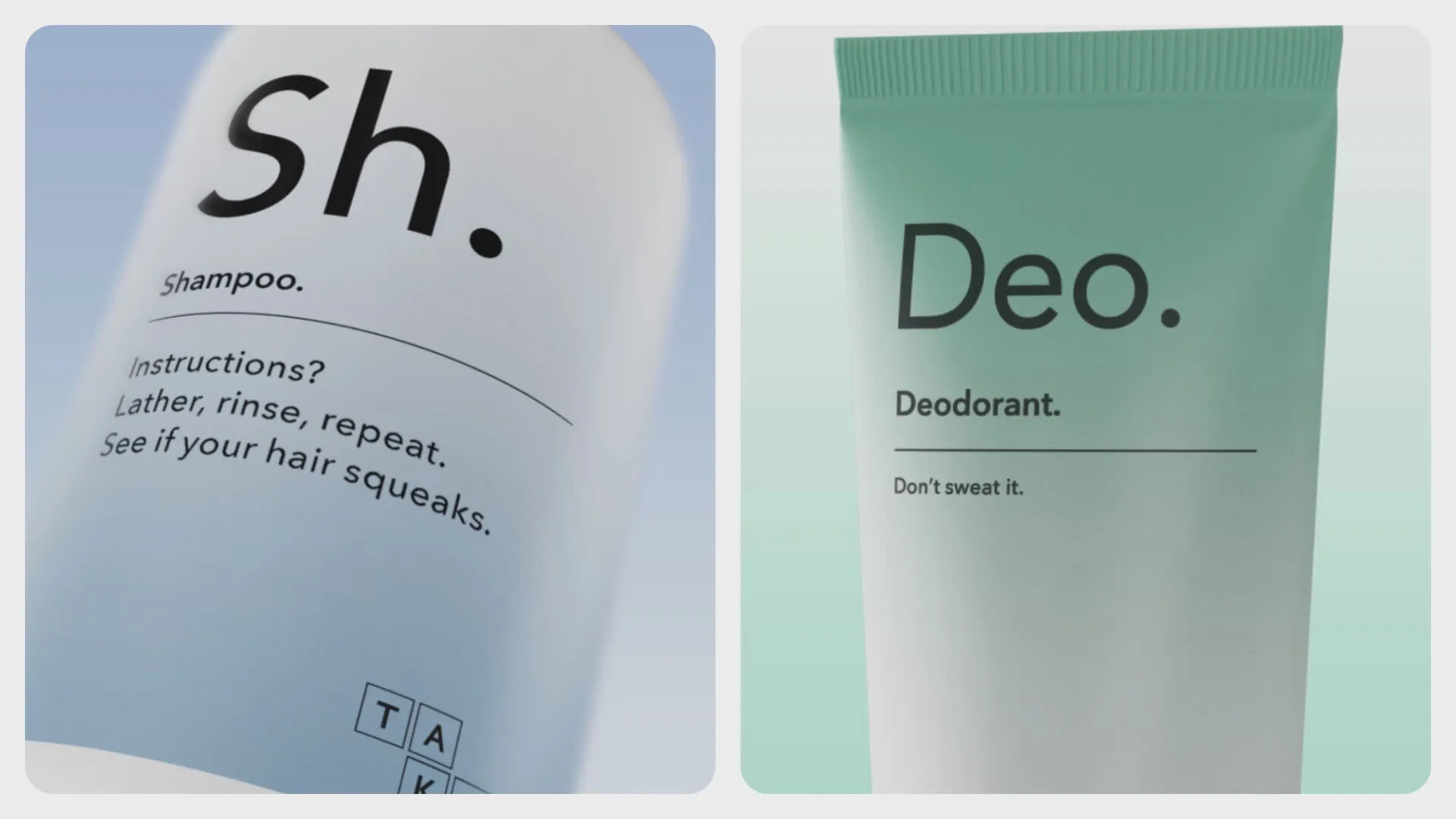
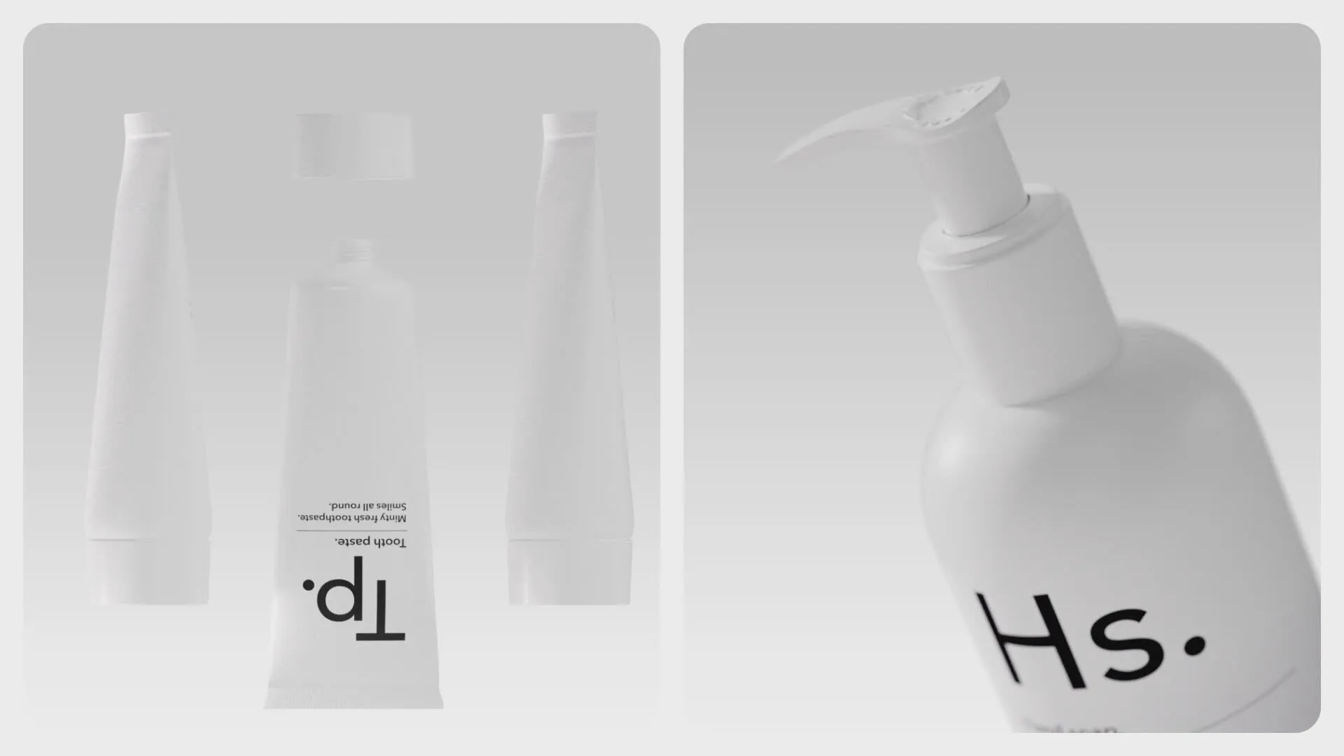
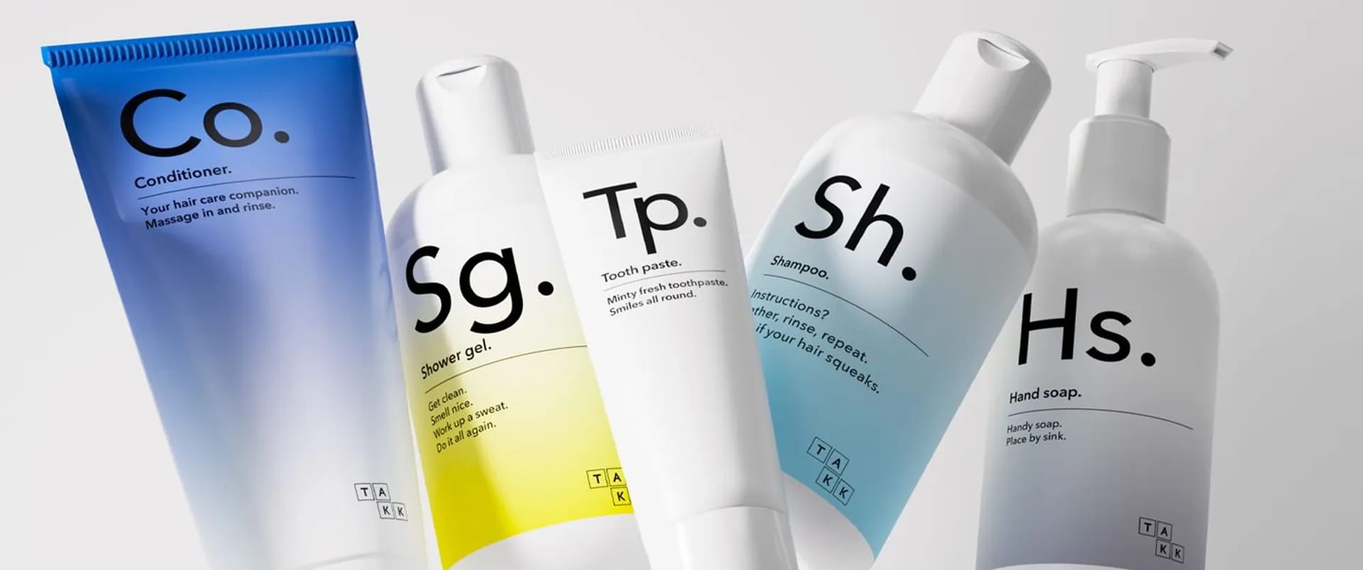
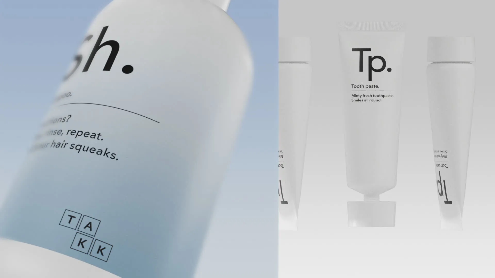
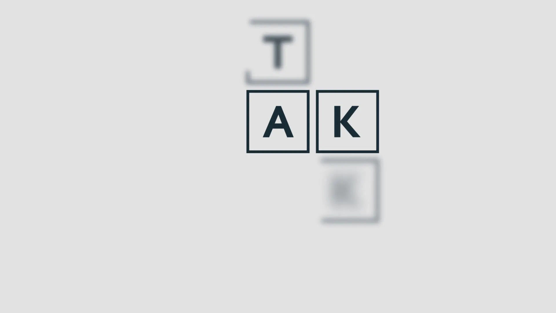
We created the name Takk, drawn from the Scandinavian word for thanks, and paired it with a minimalist design system built for a brand that deals only in beautiful essentials. The logo sits in four simple boxes, reshaped to fit any application. We carried that same minimalism into the packaging, product names stripped back to their almost elemental form, like entries on a periodic table. Paired with playful, on-brand copy in place of standard product info, building a relationship with subscribers one bottle at a time.


Powering alignment
As the range evolves, more sustainable packaging, more sustainable materials, so do the opportunities to deepen that relationship. A new line of mouthwash and toothpaste tablets, for instance, led to bespoke metal tins customers buy once and refill, cutting packaging waste with every top-up.